WeGetFunded
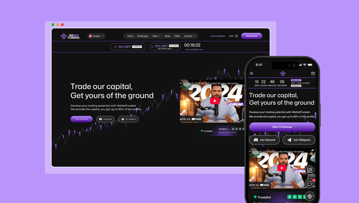
WeGetFunded is a prop firm that helps aspiring investors get started through a series of evaluation challenges. My role was to completely redesign the website to match the standards of top competitors, with a strong focus on building trust through a secure, legitimate platform and delivering a smooth, engaging user experience.
My role
UX/UI Designer
Client
WeGetFunded
Timeline
3 month
Overview
Context
WeGetFunded is a prop firm that supports traders through evaluation challenges to access funded accounts. The previous website lacked credibility and did not inspire trust—crucial for users expected to trade hundreds or even thousands of dollars. The client’s goal was to highlight the legitimacy and transparency of the platform while clearly showcasing the different challenges. I was in charge of the full UX/UI redesign to create a secure, trustworthy, and competitive user experience.
Design process
The design process for WeGetFunded was fully remote and highly iterative, spanning several weeks of close collaboration with the team based in Dubai. From the outset, I conducted stakeholder interviews to deeply understand the platform’s pain points and business goals. The Art Director shared the creative vision and brand tone, setting the visual direction to ensure the new design conveyed professionalism, trust, and legitimacy—key elements missing from the previous version of the site. In parallel, discussions with the Sales Manager highlighted the importance of clearly communicating the structure of the trading challenges, limited-time promotions, and the benefits of joining the platform.
Weekly meetings with the core team allowed us to review progress, test ideas, and adjust priorities in real-time. This agile approach ensured the new design addressed both user needs and business objectives. From wireframes to high-fidelity mockups, each iteration aimed to improve usability, build trust, and position WeGetFunded as a serious and competitive player in the prop trading market.
Initial thinking
In the initial thinking phase, my goal was to fully understand the business model, user expectations, and the trust issues caused by the previous version of the site. I began by auditing the existing platform to identify usability gaps, visual inconsistencies, and missing trust elements.
The client already had a clear vision of what he wanted, which allowed us to kick off the project by focusing directly on what was working in the market. We analyzed key competitors such as GoatFundedTrader, FTMO, and others to identify best practices and opportunities for differentiation. This benchmarking phase provided valuable insights into how to elevate the user experience while staying aligned with industry standards.
Due to a very short deadline, the research phase was streamlined. It primarily focused on analyzing visual design trends and the general structures of offers across competitors. This helped us quickly define a high-end, modern design direction while identifying ways to simplify the user journey through thoughtful animations, micro-interactions, and smart functionalities that would support both clarity and engagement.
Problem statement
Challenge
The existing WeGetFunded website lacked the visual credibility, clarity, and user experience necessary to build trust with potential traders expected to invest significant amounts of money. Users found the platform confusing and unconvincing, which negatively impacted conversions and overall engagement. The challenge was to redesign the website to clearly communicate the value of the evaluation challenges, establish legitimacy and security, and position WeGetFunded as a trustworthy, competitive prop firm in a rapidly growing market.
Insights 1 : Information organisation and general layout
Disorganized Information & Poor Layout
Content lacked structure and hierarchy, making it hard to scan or understand.
Key selling points and user benefits were buried or missing entirely.
Lack of Customer Support & Communication Channels
Users had limited ways to contact the team or get help.
This created doubt and friction in the decision-making process.
Recommendation 1 : Improve website readability

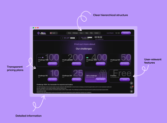
Clarify the user journey by using simplified language and a clear visual hierarchy to improve readability and help users quickly understand WGF’s services and how they work.
Highlight the platform’s value by clearly communicating the benefits, key features, and time-saving aspects — making it easy for users to grasp what sets WGF apart.
Emphasize user-centered features such as withdrawal on demand, free trial access, challenge gifting, and the WGF card — ensuring users see the flexibility and advantages available to them.
Provide flexible and transparent pricing options, allowing users to select the challenge that best fits their goals and budget, without confusion or hidden conditions.
Insights 2 : Lack of customer support
The original website offered very limited or unclear ways for customers to contact the team or get assistance quickly. This absence of accessible customer support channels created uncertainty and hesitation among potential users, undermining their trust and willingness to commit.
The missing communication options—such as live chat, an easily accessible FAQ, or responsive email support—left customers feeling unsupported, which was especially problematic given the high stakes of investing significant amounts of money.
Recommendation 2 : Provide multiple customer support options
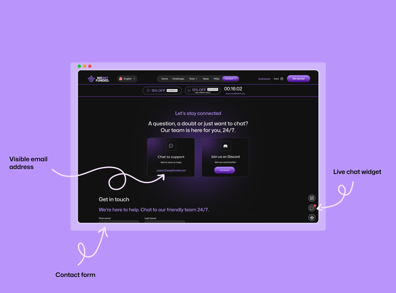
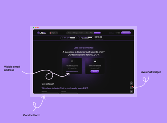
Integrate a Live Chat Widget Allowing users to ask questions in real-time and get immediate assistance by using AI chatbots to handle common queries 24/7.
Create a Comprehensive FAQ Section by organizing it by topic (e.g., account setup, challenge rules, payments)and making it easy to search and navigate, reducing the need for direct support.
Make contact options clearly accessible, by adding prominent links or buttons to reach support — such as a visible email address in the footer and a dedicated contact form.
Introduce a Contact and About page to build trust and make it easier for customers to connect with WGF and understand who’s behind the platform.
Insights 3 : Unappealing, Unprofessional, and Mobile-unfriendly interface
The website’s overall design felt outdated and lacked visual appeal, giving an unprofessional first impression that negatively impacted user trust. The absence of a proper navigation menu forced users to scroll excessively to find information, creating friction throughout the browsing experience.
Additionally, the mobile version was poorly optimized, with layout and usability issues that made it difficult to navigate on smaller screens — despite the fact that many users were accessing the site from mobile devices.
Recommendation 3 : Make it more professional

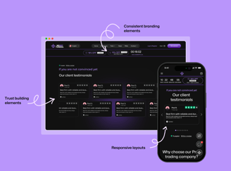
Redesign the Visual Identity
Create a clean, modern, and professional UI that builds trust at first glance. Use consistent branding elements (color palette, typography, iconography) to reflect WGF’s legitimacy and premium positioning.
Rebuild the Mobile Experience from Scratch
Prioritize mobile usability with responsive layouts, touch-friendly components, and optimized spacing. Ensure all interactive elements (buttons, menus, forms) are easily tappable and legible on smaller screens.
Leverage Micro-interactions & Animations
Use subtle animations and transitions to make navigation more intuitive and engaging.
Include Trust-Building Elements
Showcase testimonials, real-time stats, or certifications to establish credibility. Add a clear "About" section with real faces behind WGF to humanize the brand.
Takeaways
Reflection
This project was a valuable experience in balancing tight deadlines with high design standards. Working remotely with a team based in Dubai required strong communication, adaptability, and clear planning. Weekly check-ins with the art director and the sales manager allowed for continuous alignment on goals, visuals, and content priorities. Despite time constraints, we delivered a full redesign that not only improved the platform's credibility and usability but also strengthened the brand’s position in a highly competitive market. It highlighted the importance of structured collaboration, rapid iteration, and trust in the process.
You can go check their website here : https://wegetfunded.com
