Thrifted Trends
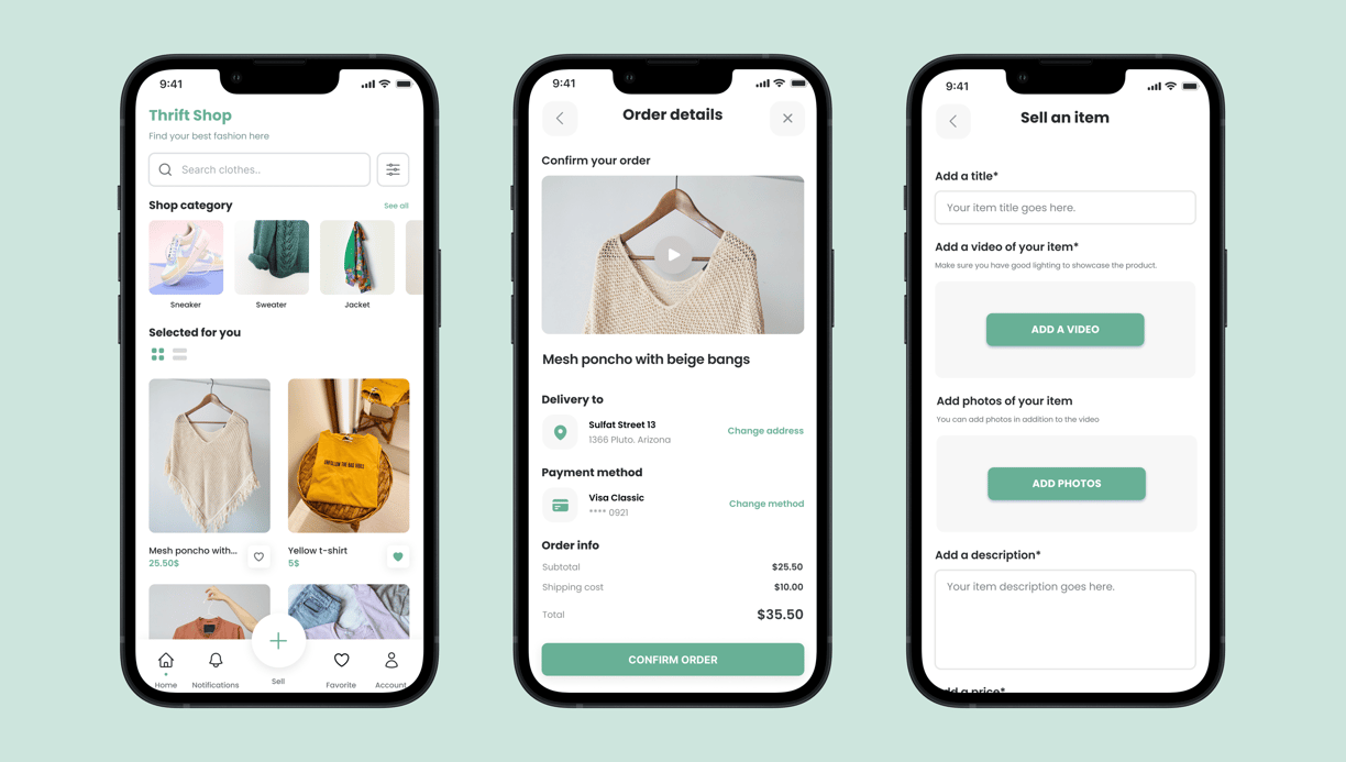

Thrifted Trends is a mobile app that lets users easily buy and sell second-hand clothes and accessories. The platform focuses on offering a wide range of high-quality items at competitive prices, making sustainable fashion more accessible and user-friendly.
My role
UX/UI Designer
Project
UX Design certificate project
Timeline
2 months (2022)
Overview
Context
To strengthen my design process and explore new methodologies, I decided to take the UX Design Certificate project. My goal was to deepen my understanding of user-centered design and discover fresh approaches to problem-solving in digital products. For the final project, I chose to work on a second-hand clothing app — a topic that resonates personally with me, as I regularly use these types of platforms and strongly believe in more sustainable ways of consuming fashion.
Initial thinking
The project began with a simple yet powerful observation: while second-hand fashion apps exist, they often fall short in terms of user trust, product transparency, and ease of use. From the start, I wanted to design a platform that not only made it easier to browse and purchase second-hand clothing, but also instilled confidence in the quality of each item.
Inspired by my own frustrations with existing apps, I focused on a feature that felt missing: short videos of each productto better reflect its real condition and avoid unpleasant surprises. This idea became a core part of the product vision, aiming to create a smoother, more transparent buying experience.
Design process
Research & Benchmarking
I began by studying competitors like Vinted, Depop, and Vestiaire Collective to understand what worked, what didn’t, and what users expected. I also gathered feedback from frequent users of these platforms to uncover pain points and opportunities.User Personas & Journey Mapping
I created user personas representing both buyers and sellers. Mapping out their typical journeys helped me identify friction points, such as lack of clarity about item condition, payment processes, or communication delays.Sketches & Wireframes
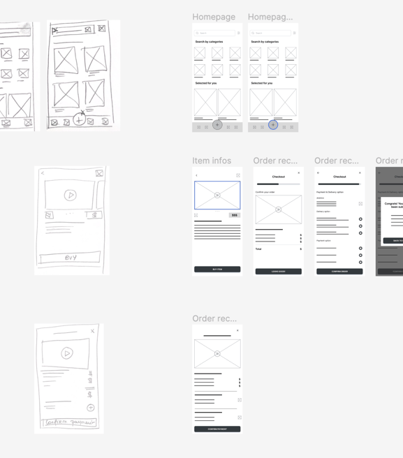
With key features in mind — including item video previews, seller ratings, and saved searches — I sketched several layout options and translated them into wireframes. The goal was to keep navigation intuitive, while making visuals central to the experience.UI Design & Prototyping
I developed a clean, modern interface with a friendly tone and minimalist aesthetic. The design emphasized product visuals and trust-building elements like verified sellers and reviews. I built interactive prototypes in Figma to test and iterate quickly.User Testing & Refinements
I shared the prototype with users who were familiar with second-hand platforms. Their feedback helped refine micro-interactions, improve product filters, and simplify the listing process for sellers.

Problem statement
Challenge
While second-hand fashion apps have grown in popularity, many users still struggle to trust the quality of items sold online. Static images often fail to show the real condition of the clothing, leading to disappointment upon delivery. In addition, platforms are frequently cluttered, unintuitive, or difficult to navigate, especially for new sellers or casual buyers.
There is a clear need for a more transparent, user-friendly, and trustworthy experience that allows users to confidently buy and sell second-hand fashion, with better visual representation of products and a simplified interface tailored for mobile.
From theory to the reality of a Hi-Fi prototype
Taking the UX Design Certificate course gave me a solid foundation in user-centered design principles, but the real challenge was translating that theory into a functional, polished product. Throughout the project, I applied every step of the UX process — from research and ideation to prototyping and testing — to build a solution that directly responded to real user frustrations.
Moving from low-fidelity sketches to a high-fidelity prototype allowed me to bring the concept to life. I focused on crafting a visually engaging, intuitive interface that aligned with modern mobile usage patterns. I integrated micro-interactions, clear call-to-actions, and a streamlined flow — all while keeping users' trust and ease-of-use at the center of every decision.
This hands-on experience helped me bridge the gap between academic learning and practical execution, reinforcing the value of thoughtful design decisions backed by user insights.
User testing insights
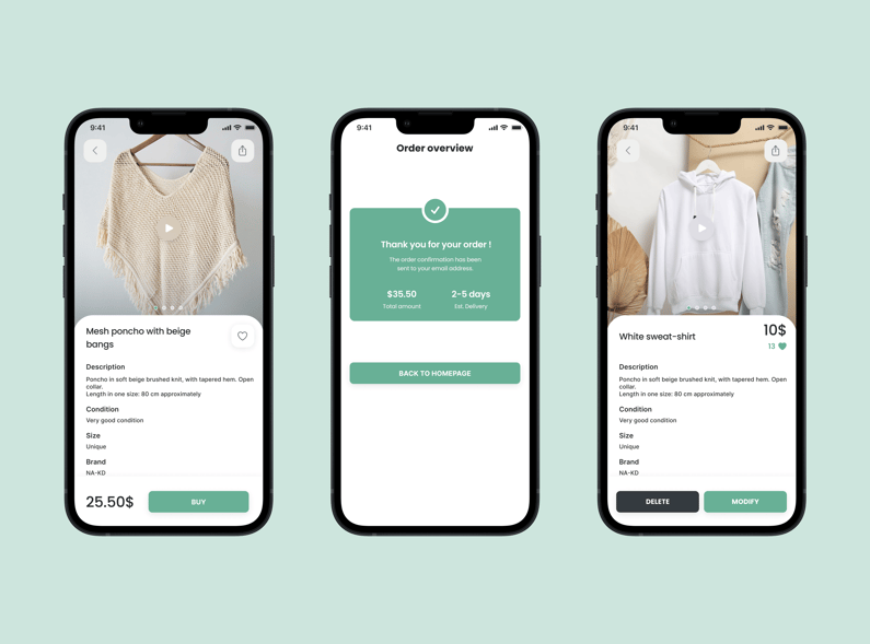
During the prototype testing phase, I gathered valuable feedback from users that helped refine key aspects of the interface and overall experience:
“Sell Item” Button Wasn’t Clear Enough
Several users struggled to understand the purpose of the main “Sell” button. Without a label or additional context, it wasn’t immediately obvious that this was the entry point to list an item for sale. As a result, I added a text label under the icon to make the action more intuitive.Add to Favorites from the Homepage
Users expected to be able to quickly save items they liked while browsing the homepage. The absence of a visible “like” or “heart” icon made the experience feel limited. Based on this insight, I introduced a "favorite" button directly on item cards, allowing for quicker and more seamless interaction.
These small but meaningful adjustments significantly improved the overall usability of the app and brought it closer to users’ real expectations and habits.
Expended to web
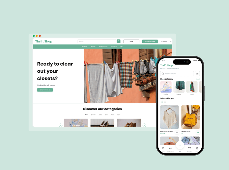

Although the mobile experience was at the heart of the project, we also explored how the platform could translate to a responsive web version. The goal was to ensure that users could access Thrifted Trends seamlessly across devices, whether they were listing an item from their phone or browsing comfortably from their desktop.
The web version retained the same visual identity and core functionalities as the mobile app but adapted the layout for larger screens — with more visual breathing room, enhanced filters, and a grid-based structure for browsing. This allowed for a consistent yet optimized experience across platforms, while keeping accessibility and responsiveness in focus.
By designing for both mobile and desktop, we ensured Thrifted Trends could meet the needs of a broader audience and reflect the flexibility users expect from modern marketplaces.
Takeaways
Reflection
Working on Thrifted Trends was an opportunity to put theory into practice — and to confront real design challenges that go beyond templates and best practices. One of the biggest lessons was the importance of clarity in user actions, especially when designing mobile-first experiences. Small interface decisions — like adding a label or repositioning a button — had a major impact on usability.
This project also reinforced the value of user testing, even at early stages. Gathering feedback helped me uncover blind spots and validate assumptions before going too far in the wrong direction.
Finally, managing both mobile and web experiences taught me how to adapt a design system across platforms, while keeping visual consistency and usability at the core. It was a rewarding experience that deepened my understanding of end-to-end UX, from research to high-fidelity prototyping.
